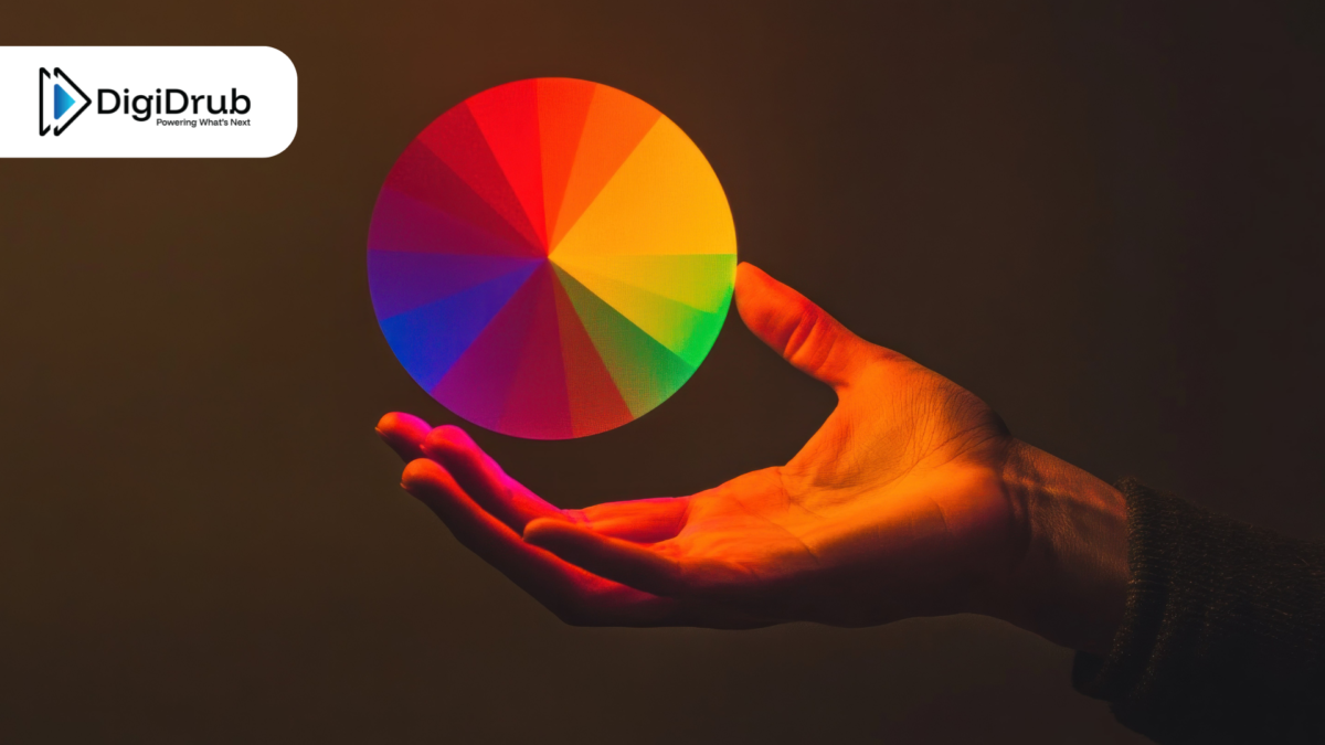
As consumers immerse themselves further and further in today’s hyper-competitive digital landscape, they are overwhelmed by a plethora of choices when it comes to products, brands, and information. So how do you, as one of these several brands, make your mark on the customer’s consciousness before all your competitors? One of the most effective ways is – color.
The Power of Color
Color is one of the simplest and swiftest ways to communicate a brand’s unique identity, even before a single word is read. This is even more pertinent in the modern digital scenario, where brands have a scant few seconds to grab the audience’s attention.
Research shows that first impressions are formed in as little as 90 seconds, and 62% to 90% of those first impressions are based on color alone. Be it logos, icons, ads, websites, or social media, color is fundamental in shaping the consumer’s opinions, emotions, and perceptions.
Color Psychology in Branding
It’s evident that color isn’t a mere decoration or design choice – used advantageously, it is a powerful branding mechanism. As a psychological signal, color influences the subconscious views and behavior of the consumer.
Brands that consistently use distinctive signature color palettes have significantly higher consumer recall, and can increase their brand recognition by nearly 80%, a considerable advantage in competitive digital marketplaces. In this era of short attention spans and rapid scrolling, using color in a smart way, such as a website header, CTA button, or a social post, can directly impact brand preference, reinforce credibility, and influence purchasing behavior.
The Intrinsic Language of Colors
To align brand value with apt visuals, it’s important to understand the varied emotional associations that are linked to each individual color. Let’s take a look at the language of each hue.
Blue:
- Conveys calm, trust, and reliability
- One of the most preferred colors in the U.S.
- Chosen by brands aiming to impart security and stability
- Popular uses: healthcare, finance, technology, SaaS
- Examples: Facebook, IBM, PayPal
Green:
- Communicates growth, renewal, and wellbeing
- Used by brands to evoke good health, eco-consciousness and sustainability
- Popular uses: nature/environment-based platforms, finance, wellness-related brands
- Examples: Subway, Patagonia, The Body Shop
Red:
- Sparks excitement, energy, urgency, and passion
- Utilized to grab attention and drive a desired action
- Popular uses: calls to actions, sales promotions or clearances, food brands, sports brands, entertainment platforms
- Examples: Coca-Cola, YouTube, KFC, Ferrari
Yellow:
- Evokes warmth, optimism, and creativity
- Can be overwhelming or dominating due to its intensity
- Works best in small doses or as accents
- Popular uses: industries needing high visibility, speed, happiness/appetite stimulation
- Examples: McDonald’s, Post-It, Ikea
Black:
- Represents authority, power, sophistication
- Can be utilized as a neutral background, enabling other colors to pop
- Popular uses: Premium and luxury industries
- Examples: Apple, Chanel, BMW
Choosing Brand Colors: Our Expert Tips for the Perfect Palette
- Focus on Brand Personality
Start off by defining the personality of the brand, along with the core emotional values to be communicated to the target audience. Is the vibe bold, unconventional, and innovative, or calm and reliable? A startup targeted towards Gen Z could opt for unconventional, vibrant colors, while a B2B enterprise might benefit from more muted, professional hues. The choice of selected color palette needs to visually reinforce the brand voice and mission. - Prioritize Consistency
It is vital to maintain a unified visual identity across the marketing palette. Be it the logo, website, social media, ads, packaging, or advertising materials, maintaining color consistency is essential. This helps in creating a strong brand presence, enhancing brand recognition, cultivating stronger customer loyalty, and establishing a clearer identity in competitive markets. - Create a Flexible, Scalable Palette
Modern brands don’t rely on a single color alone. Typically a strong brand identity includes a primary color, complementary secondary colors, and accent shades that work harmoniously together across platforms. In the modern world of digital-first branding, this flexibility is essential so that designs can adapt seamlessly and maintain brand recognition across social media, websites, mobile apps, and ads. - Test for Accessibility and Usability
While selecting colors, it’s important to make sure they are inclusive. Text and interface elements should meet accessibility standards, like WCAG contrast guidelines, ensuring that all users can engage effortlessly with the brand. It is advisable to utilize different tools that simulate color accessibility to assess how a particular palette will perform in real-world conditions. Brands that adhere to accessibility guidelines are known to reach wider audiences while signalling diversity and inclusivity.
Conclusion
Employed strategically, color theory in branding becomes a powerful tool that enables businesses to build trust, stand out, and create lasting emotional connections. At DigiDrub, our digital team is committed to delivering exceptional branding and marketing strategies, custom web design services and best-in-class technologies and resources. Reach out to us for a consultation now.


